
Must-Haves for a High-Converting Website
19 Essentials For A High-Converting Shopify Site

Conversion Rate Optimisation is a hot topic right now. Unlike other marketing buzzwords, Conversion Rate Optimisation, or CRO, is a valuable tool when it comes to making sales.
And if there’s one thing we know, it’s how to maximise conversions on a Shopify website.
Having built a number of brands from no sales to 6-figure months, we’ve learnt a thing or two along the way.
Here are our top tips for a high-converting Shopify website including our favourite apps.
#1) Make sure the site loads quickly
With most of us doing our online shopping on mobile, we have a million other apps we could be drawn into (hello TikTok!) so our attention span is about this big | |. If your site isn’t fast to load, you’ll lose people instantly (go check that bounce rate in Google analytics).
Here’s how to speed it up:
Choose A Lightweight Shopify Theme.
Reduce Large Image Sizes.
Compress Images.
Replace GIFs With Static Images.
Lazy Load Images.
Limit Third Party JavaScript & Shopify Apps.
Migrate Tracking Codes To Google Tag Manager.
Run Your Store Through Google PageSpeed Insights.
#2) Build for mobile-first
Most DIY eCommerce store owners will build their site on a laptop, and don’t give much thought to how their site looks on mobile view. With up to 90% of Shopify traffic coming from mobile devices, it makes better sales sense to focus on your mobile site first, and THEN work on the desktop view.
Think about:
Use a fixed navigation bar
Position your product photography front and centre
Minimise your use of text on product pages
Encourage shoppers to take action with a sticky “Add to Cart” button
Use real photography for your product variants
#3) Create bundles to increase AOV
Average Order Value, or AOV, is a good indicator of how well your eCommerce store converts. Increasing your AOV is a fantastic way to improve your bottom line. I love this method, and recommend all of my clients do it in some way. When companies pair several products together and sell them for less money than each would be individually, it’s known as bundle pricing. Bundle pricing is a good way to move a lot of inventory quickly. A successful bundle pricing strategy involves profits on low value items outweighing losses on high value items included in a bundle.
My favourite bundled offer examples:
https://180nutrition.com.au/category/bundles/
https://www.mecca.com.au/skin-care/skin-care-packs/
https://www.bubakin.com.au/product/essential-starter-nappy-kit/
https://thegoodplantco.com.au/pages/room-bundles
When it’s time to scale and start spending more money on ads, you’re going to find that your return on ad spend is far higher when you have a bundled offer. By the time potential customers land on your site, they’re usually ready to buy, so spending an extra 30% doesn’t seem like a big deal – their wallet is already out.
There are a heap of apps on shopify that you can use to bundle products. Here are a few for you:
https://apps.shopify.com/bundler-product-bundles?ref=x2click&utm_campaign=shopblog
#4) Back in Stock App
Have you ever wished there was a way to build your email database and understand product demand on auto-pilot? Or even better, do you want to drive and measure demand when you release a new range?
Enter — Back In Stock app (on Shopify)
I simply love it, and recommend it to all of our clients.
This app assists in building rapid first party data, including growing your email and SMS database.
When an item is out of stock (or coming soon!) customers can pre-register their interest for the product, including the size they would like. To do so, they are required to input their name, email and *optional* phone number to be added to the ‘waitlist’ for the item.
When you add inventory for the item in the backend of your Shopify store, the customer is automatically notified via email or SMS – which leads to instant sales uplift.
Plus, with the help of a developer you can have the email custom designed to match your branding too- winning!
eCommerce optimisation will change your business; measure demand, see wait lists, grow your database and drive sales…all on auto-pilot. That’s a very enthusiastic YES from me!
https://apps.shopify.com/back-in-stock
#5) Privy App
I love this for pop ups but it has loads of other features too, including:
Pop Ups
Spin to Win Wheels
Overlays
Cart Savers
Free Shipping and Sign Up Bars
Banners
Flyouts
Embedded forms
Tabs
https://apps.shopify.com/privy
#6) Review apps Loox
Reviews and social proof have a LOT of bearing on whether or not someone trusts your site and brand – particularly when you are starting out and have no brand equity yet.
The Loox app on shopify automatically collects customer reviews with photos and videos, and beautifully displays happy customer content. This allows you to boost trust, drive word of mouth sales and referrals, while increase customer retention and sales. Loox verified reviews, particularly photo and video reviews, are your greatest asset when it comes to increasing brand awareness and improving conversion rates.
This is a no-brainer, but we have to say it: tThe best rule to follow when setting your minimum order value eligible for free shipping is: average order value + 15% or 20%.
If you already have free shipping for orders above $50, for example, you can offer free next-day shipping for orders of $150 and above.
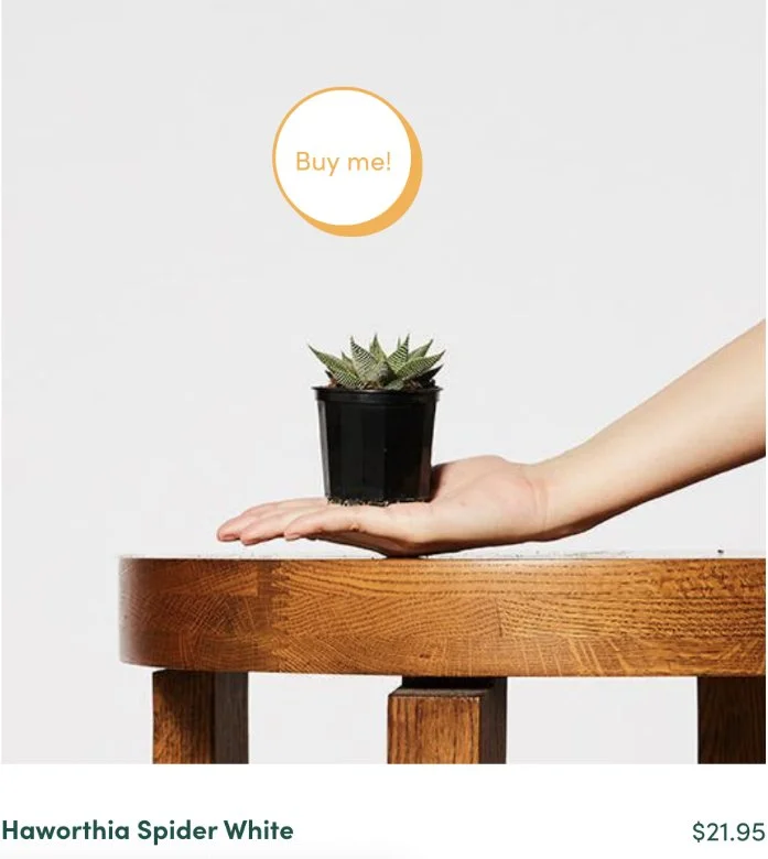
#7) High-quality photography
They say a picture is worth a thousand words. I recommend using both in-context and standard product shots. If you have a well defined target market, make sure you use the right age and demographic in these photos. E.g. you wouldn’t sell expensive linen kaftans to a teenager, so using a young model in your images is unlikely to appeal to your target demographic – and may work against you.
#8) Free shipping
This is a no-brainer, but we have to say it: tThe best rule to follow when setting your minimum order value eligible for free shipping is: average order value + 15% or 20%.
If you already have free shipping for orders above $50, for example, you can offer free next-day shipping for orders of $150 and above.
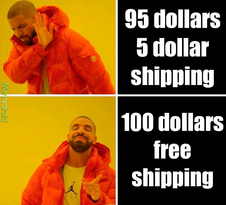
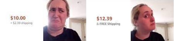
In both cases, it’s a good idea to display a prompt saying, “spend X more and get free shipping”. Research by the UPS found that 69% of online shoppers have bought more than they originally intended, simply because they didn’t want to pay for shipping. Shocking and anti-logic, right? But if that’s what it takes, who are we to judge?
#9) Play with pricing psychology
This may seem like a totally obvious one but we have to cover it.
Psychological pricing, otherwise known as Charm Pricing, is the business practice of setting prices lower than a whole number.
Researchers at MIT and the University of Chicago have proven that prices ending in 9 create increased customer demand for products. This psychological phenomena is driven by the fact that we read from left to right, so when we encounter a new price at $1.99, we see the 1 first and perceive the price to be closer to $1.00 than it is to $2.00. In essence, ending your price in a 9 convinces customers that you’re offering a great deal.
The prevalence of charm pricing has created the opposite effect as well. While prices ending in 9 connote a “value price”, prices ending in 0 now connote a “prestigious price.” So, if you’re selling a “high-class” product, like a diamond ring, you might be better served ending your price with a 0 to give your customers the impression that they’re paying for something that is expensive and worthwhile. This is why you’ll never see the price of a Chanel bag ending in .99. For a great example, take a look at most of the sales on Gilt Groupe’s flash sales – all of the before prices will end in 0s or 5s while the after prices will end in 7s, 8s, and 9s.
Feel free to take advantage of this fact in your pricing. If your price is originally $100, try selling it for $99 and see if there is a difference in your sales. NOTE: This is different from A/B testing to find your pricing, as here you already know your optimal price point and are using A/B testing to find the optimal design of your pricing page.
Your overall pricing strategy should choose one of the above – either the .99 strategy or the whole number strategy – and stick with it.
When it comes to bundles and discounts, which do you think is a better deal: “Buy one get one free” or “50% off two items?” According to a study done by researchers at the University of Minnesota, most people would prefer the first option, even though the two options are identical (buying two items at 50% off is the same as paying full price for one and getting the second free).
This phenomenon is known as innumeracy, where consumers are unable to recognize or understand fundamental math principles as they apply to everyday life. (I bet those high school math classes are coming back to haunt you now!) Other ways that innumeracy appears in pricing include double discounting, coupon design, and percentage pumping.
Finally, a great method of pushing an offer such as a sale is having scarcity front and centre. I’d recommend having a countdown timer in place. Here’s a great app to help you do this: https://apps.shopify.com/sales-countdown-timer-bar?surface_detail=merchandising-pricing&surface_inter_position=1&surface_intra_position=4&surface_type=category
#10) Add secure payment signals
According to research by the Baymard Institute, 17% of cart abandonment was due to security concerns and the fact that the shopper didn’t trust the site with their credit card information.
These trust badges or trust signals let online shoppers know that your Shopify store is legitimate and that their data will always be secure. Remember, Shopify offers a high level of security for consumer information that’s processed by highly trusted third-party service providers.
However, the online shopper won’t always know that your store is hosted by Shopify. For example, the default URL is [your-shop-name]. myshopify.com, but many Shopify merchants decide to make their own store URLs. If that’s the case, then you have to convey to the consumer that your store is secure and they can feel comfortable giving their personal information and payment details.
There’s also an issue in eCommerce where lots of online stores – usually based overseas – sell knockoff products. If you use certain trust badges that tell consumers that your store is the real deal and that the products you offer aren’t fake, then you’ll not only boost consumer trust but also improve user experience (UX).
A good UX means that users stay longer on your online store and the longer they stay, the more likely they are to buy something.
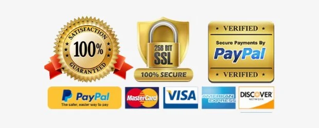
Secure checkout trust badges are arguably the most important trustmarks in your Shopify store. They come at a crucial point when the customer will ask themselves: Do I trust this merchant? Is this store legit or is it shady? These badges tell the customer: Your information is secure, so go ahead and make that purchase!
What does “secure checkout” mean exactly? It means that your website – or your Ecommerce platform – has security measures in place to protect sensitive information. Most of the time, this means secure sockets layer (SSL). Let’s not get too technical about it, but SSL is basically a way to encrypt online data.
Although there are lots of checkout trust signals available, some merchants like to design their own. This is either to match their website design or to avoid having too many badges that make the layout look “busy” or “cluttered”. This is easy to do with the apps we list below!

Here’s a good example of a secure checkout badge:

The phrase safe checkout is also used:
As you can see from the examples, the icons most frequently used in these badges are locks or shields. The reasoning for that is simple: these symbols quickly convey security, strength, and defense. It means your Shopify store is a fortress and all information is safe.
If you’re using multiple payment gateways that all have SSL encryption (this is almost certainly the case), you can also choose a general SSL trust badge:

As you can see, it’s all about locks and shields! Those are the most common icons when it comes to secure checkout trust badges.
Accepted Payments
These trust badges are pretty straightforward: they tell the consumer what forms of payment you take. They’re related to the Secure Checkout badges, so merchants frequently combine the two to get the most effective trustmark. Not every online shopper will know what SSL Secure means, but just about everybody recognizes the VISA logo.
Once again, they boost trust so that the online shopper feels secure in giving out their payment and personal information. Displaying logos for Mastercard, Visa, Google, PayPal, and others is crucial – consumers know and trust these brands. According to research, if a consumer knows the brand, then they trust it.
If you’re using Shopify, they have a standard payment gateway that is a default: Shopify Payments. This gateway takes most standard forms of payment, including credit cards, PayPal, and Google Pay. If you want, you can always expand with a third-party payment gateway to accept other forms of payment.
Let’s take a look at a trust badge that combines Secure Checkout with Accepted Payments:
#11) User-generated content
This comes back to trust again – get REAL images of REAL people using your product.
We see fashion brands using this technique really well. User generated content shows that real people buy (and love) their products, and for potential buyers, seeing the product on a person who is not a model can demonstrate how the product looks on more diverse bodies.
#12) the three click rule
One of the most well-known principles in web design is the “3 clicks rule”, which states that users must be able to find what they are looking for in three clicks or less. In theory, this reduces the user’s frustration and makes it more likely for them to stay on the website.
In recent times, it has been proven that three is not actually the golden rule, but when you are setting up your site it’s important that you make sure it’s EASY for people to add the product to the cart and check out. Having a ‘quick add’ feature so they don’t have to click into the individual product listing if needed +and a check out now button on each product can help speed things up for people.
#13) Heat mapping software
A tool like Hotjar or Crazyegg is a great way to visually see where people are getting stuck on your site. These provide heat mapping AND recordings of people’s interactions on your site so that you can make informed decisions on the design changes to optimise conversions.
#14) Sizing/colour charts
Remember the tool I mentioned earlier, Hotjar? We had a client in our agency who had a BEAUTIFUL website and products. But her site just was not converting and we honestly were all so stumped. That’s when we dove deeper into the hotjar analysis. What we found was that people were spending A LOT of time viewing the sizing charts but not actually purchasing. This told us that the sizing charts were confusing. We redid the sizing charts,
adding more information around it and boom, less confusion and higher purchases.
Making the production specifications visual can also help – if it’s clothing displaying different sized models is great. If it’s an item, having it sitting next to a common item so people can judge size is also good in addition to having the dimensions. Any way you can make sizing and colour choice as clear as possible for customers, the more sales you’ll get.
Other ways to do this:
Have a photo of the product next to something that people can compare it to. E.g. a vase next to someone’s hand, or a soft drink can.
Fashion retailer The Iconic has a cool feature where you can select your size in other brands, include your height, age, and weight, and it will tell you the best size to buy in a product.
#15) Upsells and Cross Sells
A great way to increase your conversion rate and average order value is through upsells and cross sells. I touched on bundles previously – they also apply in this context.
Don’t look at cross sells as aggressive or invasive. In a similar logic to bundles, people often need a little push for additional items when shopping. It can be accessories for the dress they just got, or coffee filters with that bag of ground coffee.
Offer things they might be forgetting or some of your slower moving items – as long as it’s helpful to your customers, it doesn’t hurt. Yes, you’ll sell more, but they get more, too!
Cross selling is easy: you simply suggest complementary products to what’s in their cart already. It doesn’t have to be a dynamic recommendation feed, especially for smaller stores – just pick a few products that go well together and offer them in a “Customers also bought”/ “Complete the look”/ “use it with” section.
An app that is great for this is https://apps.shopify.com/frequently-bought-together?ot=812641d9-71d1-4f13-a101-43999e9537a0&surface_detail=bundles&surface_inter_position=1&surface_intra_position=1&surface_type=search_ad
#16) Klaviyo
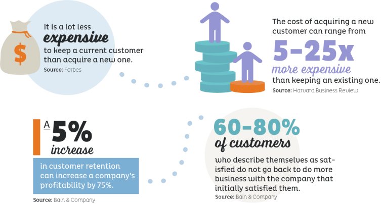
Every day I see Shopify business owners leaving money on the table.
Depending on your industry, it can be anywhere from 5 to 25 times more expensive to acquire a new customer than it is to retain an existing one. It thinks about it, when you make sense: you don’t have to jump through hoops with freebies and discount codes to retain a client, you just have to keep them happy!
Not convinced? Research undertaken by Bain & Company has shown that increasing customer retention rates by 5% can increase profits by 25% to 95%.
Introducing Klaviyo
There are a number of ways you can promote repeat customers, BUT this is a quick and easy (and free win). Allow me to introduce the best email marketing software I have found for ecommerce stores: Klaviyo.
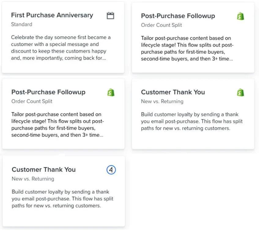
When you log into the back end of Klaviyo, you’ll see a heading on the right hand side titled ‘Flows’. I want you to click that heading and select ‘browse ideas’. BOOM – check out all of the nurture sequences you can create.
Here are my top nurture sequences I recommend you include as a bare minimum:
#17) Product FAQ app
https://apps.shopify.com/product-faq
A great way to answer any questions about the product that keep coming up.
I recommend you keep a running list of the questions you get asked about your products – if something comes up more than three times, add it to your FAQ section.
#18) Improved search bar functionality and prominence
Visitors who use the search bar / search box function generally have a higher intent to purchase than those who simply search through your menu sections. Make it easier for your visitors to find exactly what they’re looking for, faster, with a search bar – and watch your conversions increase!
#19) Afterpay
There are a lot of ‘buy now pay later’ options popping up, but Afterpay is the best known, and one of the most widely used in Australia. It’s a no-brainer adding Afterpay to your site, and to be honest? It’s almost an expectation that a buy-now-pay-later be available.
There you have it!
I hope this has been helpful